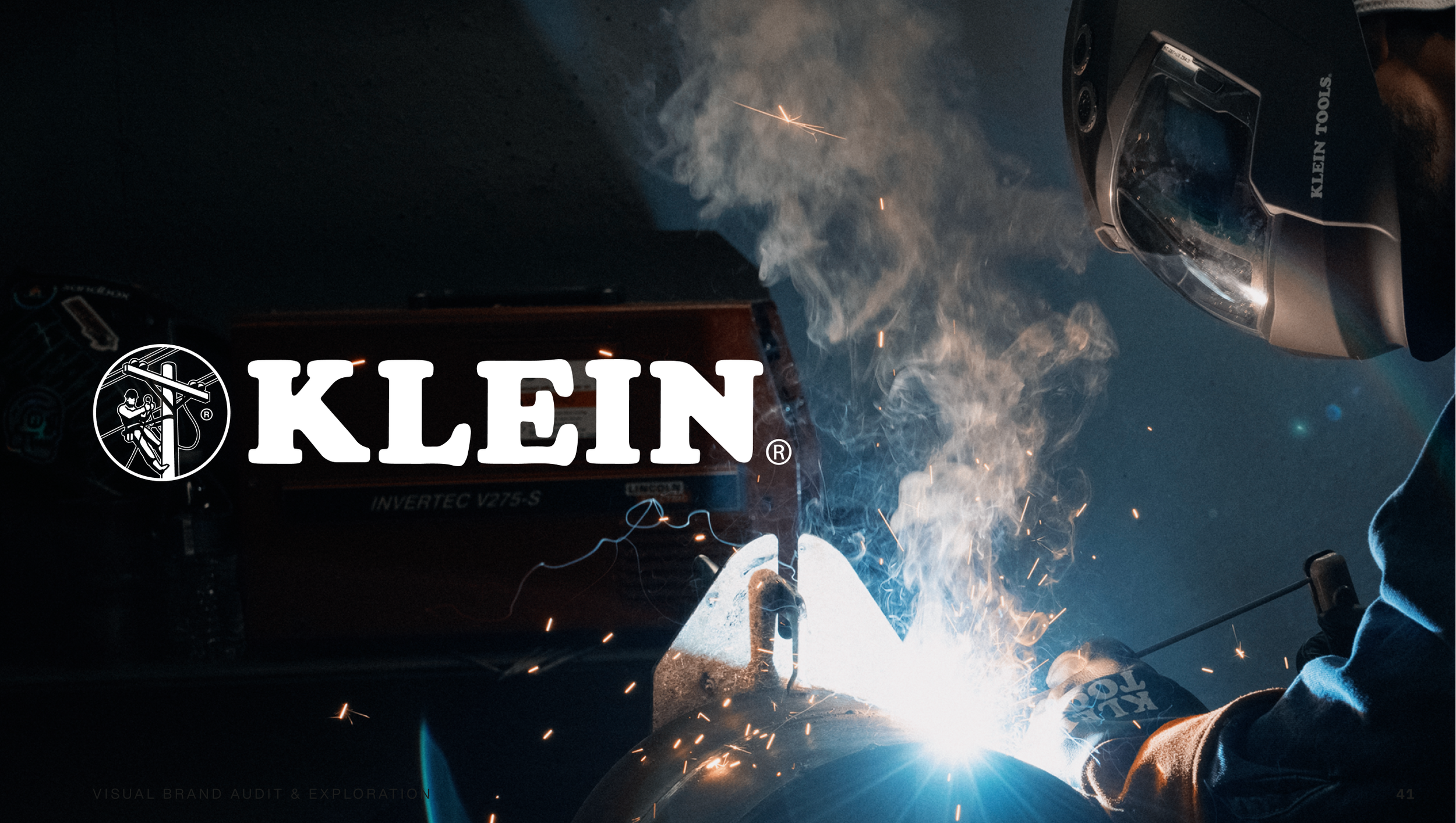
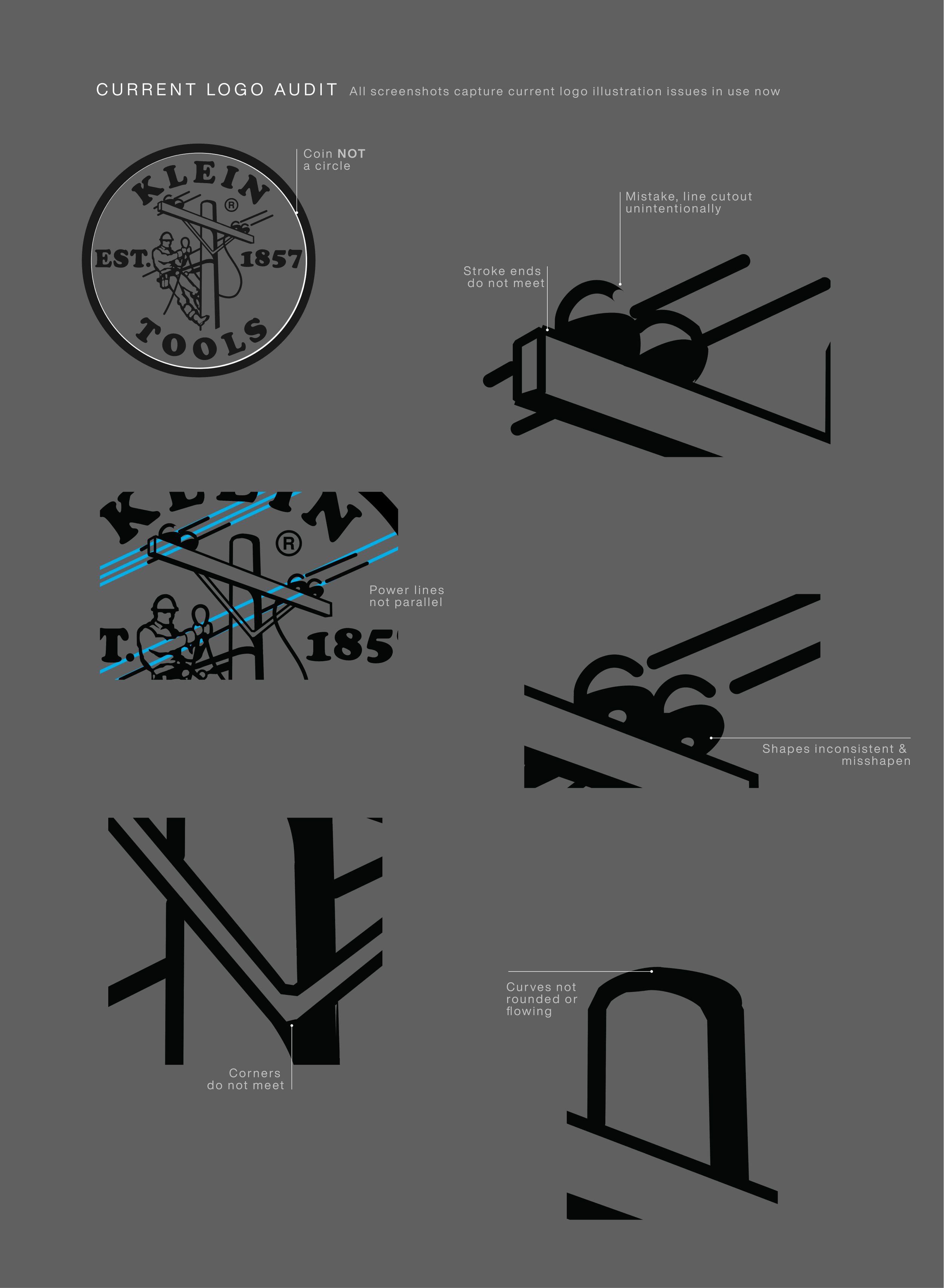
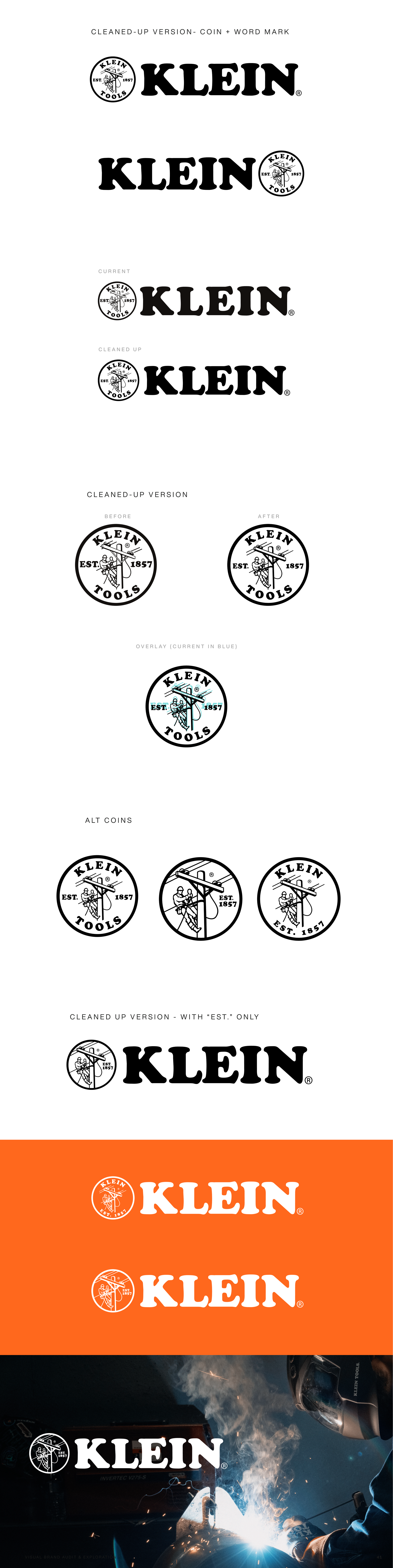
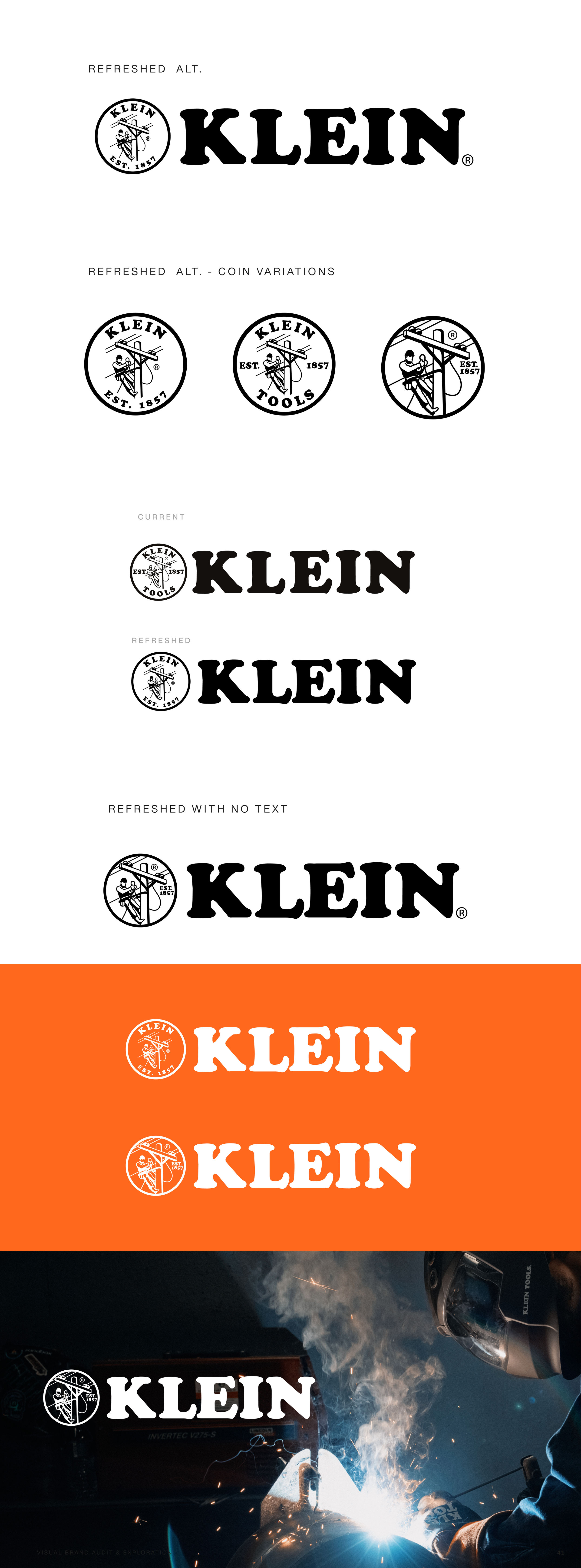
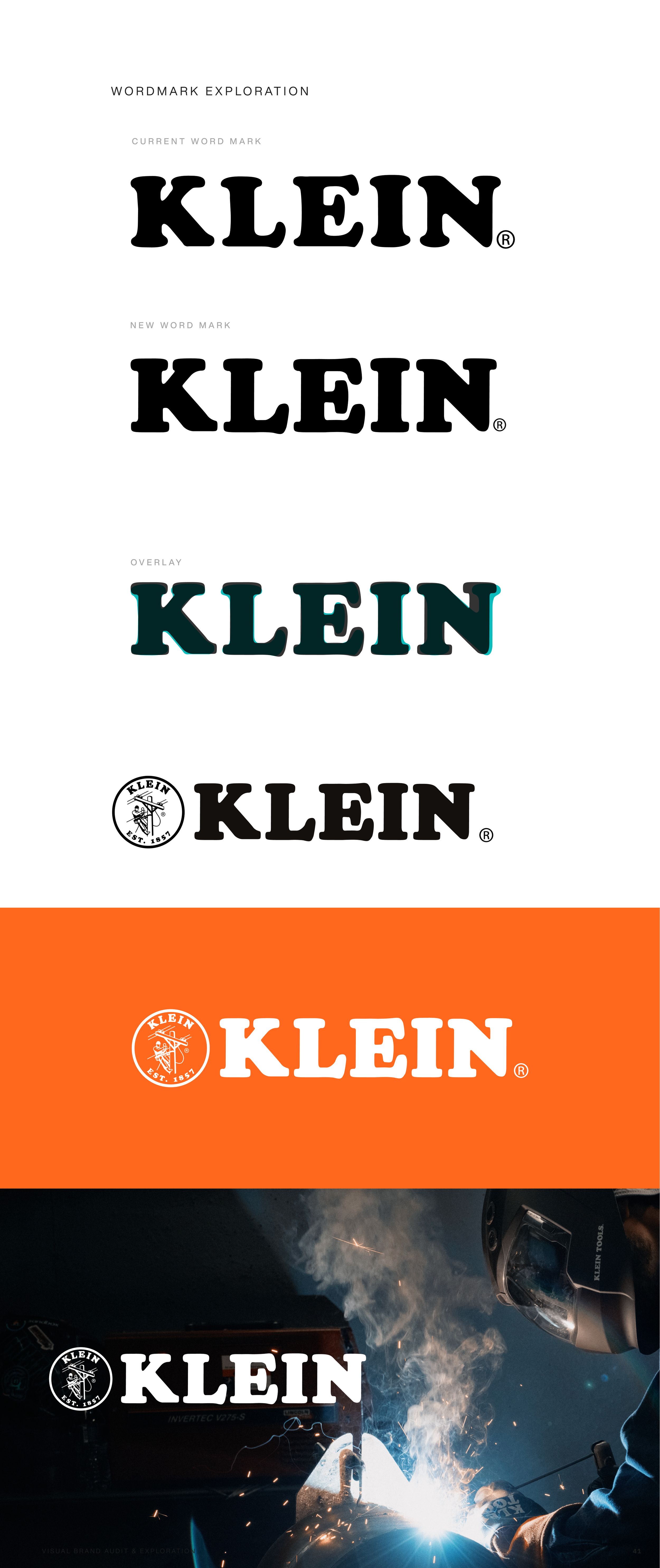
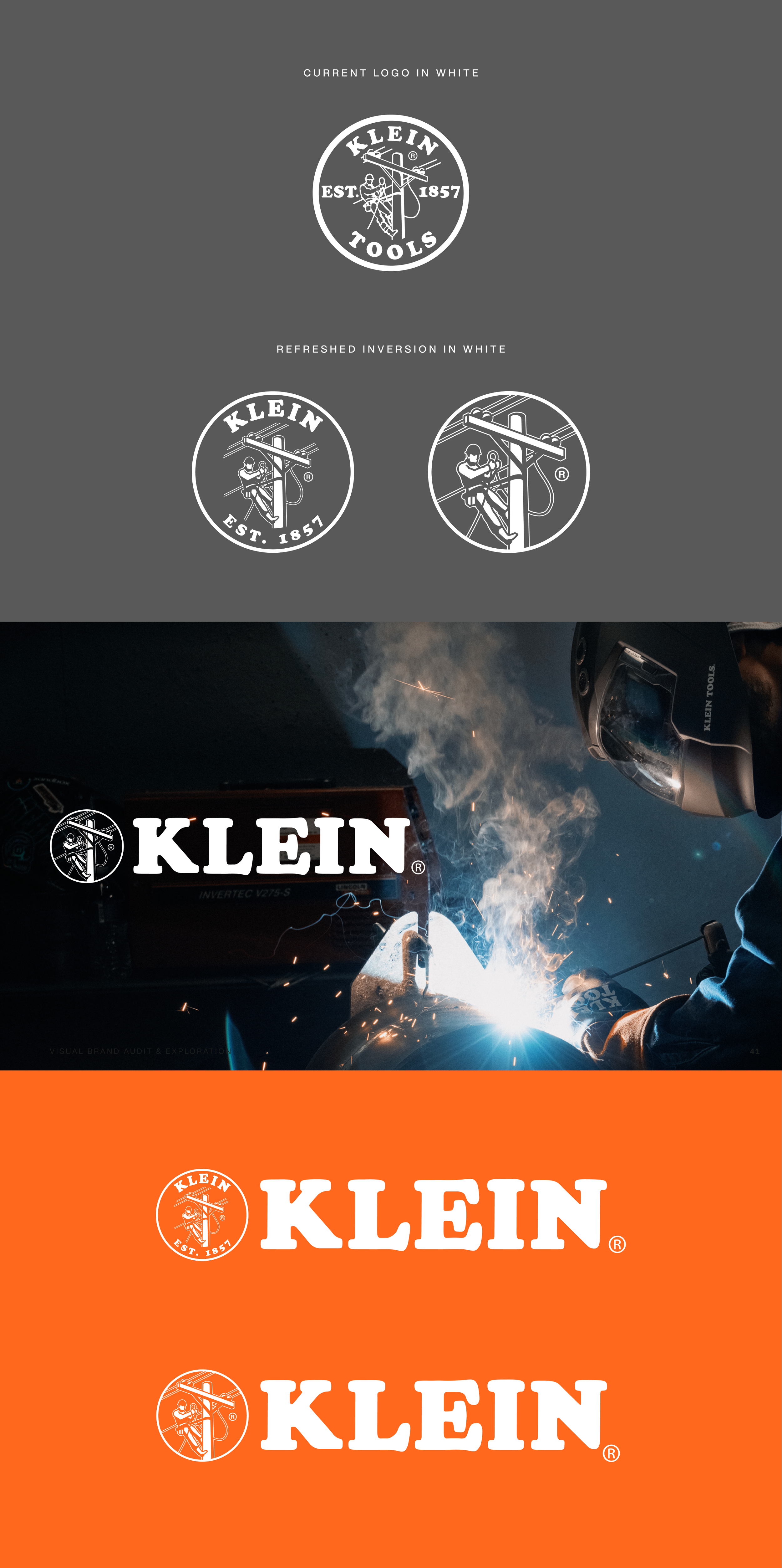
Leading creative for a brand refresh, taking an opportunity to not only audit current issues within the Klein Tools logo but also offer design solutions in order to keep the overall aesthetic of the Klein Tools Logo while also offering a much needed face lift. This progression of designs shows issues within the KT logo from the illustration, to redundancies in naming in the “coin” as well as the text beside it, refinements to the illustration, type, and inversion.